
How to Optimize Images for SEO and Speed
June 19, 2026
Category:
Uncategorized
To optimize images for SEO and speed, you must reduce file sizes through compression, use modern formats like WebP or AVIF, write descriptive alt text containing target keywords, and implement lazy loading. These steps decrease page load time, improve Core Web Vitals, and help search engines understand the visual content of your pages, which increases eligibility for image search results.
Visual assets often represent the heaviest part of a webpage. When images are unoptimized, they slow down the browser rendering process, leading to higher bounce rates and poor user experiences. Search engines prioritize pages that load quickly and provide clear context for their media. In practice, optimizing images isn’t just about making files smaller: it is about balancing visual fidelity with technical efficiency so that both humans and bots can access content without friction.
- Use WebP or AVIF formats to reduce size without sacrificing quality.
- Implement lazy loading to prioritize the visible viewport.
- Write keyword-rich, descriptive alt text for accessibility and indexing.
- Deploy a Content Delivery Network (CDN) to serve images from closer geographic locations.
- Choosing Image Formats for Speed
- Compression Techniques and Quality Control
- Alt Text and Filename Optimization
- Lazy Loading and CDN Implementation
- Responsive Images with Srcset
- Image Structured Data for Rich Results
- Common Image SEO Mistakes to Avoid
Choosing Image Formats for Speed
Selecting the right file format is the first step in reducing the payload of your website. Different formats serve different purposes, and using a JPG where a SVG would work often leads to unnecessary bloat. The goal is to use the smallest possible file that maintains the required clarity for the user.
WebP is currently the most balanced choice for most websites. It provides superior lossless and lossy compression compared to JPEG and PNG. AVIF is an even newer format that often beats WebP in size, though browser support is slightly more limited. For simple icons or logos, SVG is the gold standard because it is a vector format. This means it scales infinitely without losing quality and usually has a tiny file size.
| Format | Best Use Case | SEO/Speed Benefit | Compression Type |
|---|---|---|---|
| WebP | General photography, product images | High quality, small file size | Lossy & Lossless |
| AVIF | High-end visuals, hero sections | Maximum compression efficiency | Lossy & Lossless |
| SVG | Logos, icons, simple illustrations | Infinite scalability, tiny size | Vector |
| PNG | Images requiring transparency | Preserves detail and alpha channel | Lossless |
| JPEG | Legacy support for older browsers | Universal compatibility | Lossy |
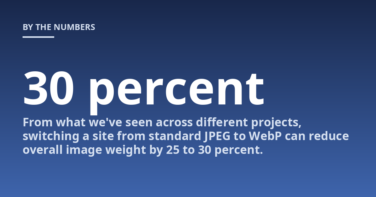
From what we’ve seen across different projects, switching a site from standard JPEG to WebP can reduce overall image weight by 25 to 30 percent. This directly impacts the Largest Contentful Paint (LCP) metric. If you use an AI-driven workflow like those at TsoDen, automation can handle this conversion process across thousands of assets simultaneously.
Compression Techniques and Quality Control
Image compression reduces the number of bytes in a file to make it load faster. There are two primary types: lossy and lossless. Lossy compression removes some data permanently to achieve significant size reductions, while lossless compression keeps all original data but optimizes how that data is stored.
For most web images, lossy compression is the practical choice. Most users cannot tell the difference between a 100 percent quality JPEG and an 80 percent quality one, but the file size difference can be massive. The truth is, many marketers upload raw files straight from a camera or stock site, which can result in single images exceeding 5MB. This is a critical error that kills page speed.
Avoid using “Save for Web” presets without checking the actual output size. Use tools like Squoosh or TinyPNG to manually verify the quality-to-size ratio. Aim for images under 100KB for standard content and under 300KB for large hero sections.
In practice, the most reliable approach is a tiered compression strategy. High-priority images (like those above the fold) get slightly more quality, while secondary images in the body of an article are compressed more aggressively. This ensures that the first thing a user sees is crisp, while the rest of the page remains lightweight.
Alt Text and Filename Optimization
Search engines cannot “see” an image the way humans do; they rely on text to understand the context. Alt text (alternative text) serves a dual purpose: it provides accessibility for visually impaired users using screen readers and tells search engine bots what the image represents.
A common mistake is keyword stuffing in alt text. Instead of writing “best-seo-agency-london-cheap-seo-services”, write “TsoDen team analyzing a technical SEO audit on a monitor”. This describes the image accurately while naturally including relevant terms. The goal is to be descriptive and helpful, not manipulative.
Filenames are also indexed. An image named IMG_4829.jpg tells Google nothing. A filename like “ai-seo-optimization-workflow.jpg” provides immediate context before the page even loads. We recommend using hyphens to separate words in filenames rather than underscores, as search engines treat hyphens as word separators.
When managing a large volume of visual assets, it is easy to end up with duplicate images across different directories. To keep your index clean and avoid confusion for crawlers, you should look into duplicate content: how to find and fix it techniques applied to media libraries. This prevents the same asset from competing against itself in image search results.
Lazy Loading and CDN Implementation
Lazy loading is a technique that tells the browser to wait to load images until they are about to enter the user’s viewport. Instead of downloading 50 images as soon as the page opens, the browser only downloads the top two or three. This dramatically reduces initial page weight and speeds up the Time to Interactive (TTI).
You can implement this simply by adding the loading=”lazy” attribute to your img tags. However, be careful: never lazy load images that are above the fold (the hero image). Doing so will actually hurt your LCP score because the browser has to wait for a JavaScript trigger before starting the download of the most important visual element.
For global audiences, a Content Delivery Network (CDN) is essential. A CDN stores copies of your images on servers located around the world. If a user in Tokyo accesses your site hosted in New York, the CDN serves the image from a Tokyo-based server. This reduces latency and prevents “laggy” image loading.
Think of it this way: lazy loading manages when the image is sent, while a CDN manages where it comes from. Both are necessary for a high-performance site. For more technical details on how these assets interact with your URL structure and indexing, reviewing canonical tags explained avoiding index bloat can help you ensure that image versions (like thumbnails vs full size) do not create duplicate content issues.
Responsive Images with Srcset
Serving the same 2000px wide image to a desktop user and a mobile user is inefficient. Mobile devices have smaller screens and often slower connections, meaning they don’t need the high-resolution version of an asset. Responsive images allow you to serve different sizes based on the device’s screen width.
The srcset attribute allows you to define a list of image versions and their widths. The browser then automatically chooses the most appropriate file for the current viewport. This prevents mobile users from downloading massive files they cannot even see in full detail, which is a significant factor in improving mobile PageSpeed Insights scores.
Based on direct experience, implementing srcset can be tedious manually but is highly effective when automated via a CMS or AI-driven asset pipeline. A typical setup involves creating three versions of every image: small (up to 600px), medium (up to 1200px), and large (original size). This ensures that no device ever downloads more data than necessary.
Image Structured Data for Rich Results
Structured data is a way of providing explicit clues about the meaning of a page to Google. By using Schema.org markup, you can tell search engines specifically what an image represents, whether it is a product photo, a recipe step, or a news article thumbnail.
For e-commerce sites, adding Product schema with an “image” property increases the chance of your photos appearing in the Google Shopping tab and rich snippets. This provides users with more information directly on the SERP, which often leads to higher click-through rates (CTR) compared to plain text links.
You can find detailed implementation guidelines on Google Search Central regarding how to format your image markup correctly. The most important part is consistency; the images defined in your schema must match the visible images on the page to avoid being flagged as misleading.
Common Image SEO Mistakes to Avoid
Many business owners believe that adding a few keywords to alt text is enough for image SEO. This is a misconception. Technical performance usually outweighs minor keyword tweaks. If your images take 5 seconds to load, no amount of alt text will save your conversion rate.
Another frequent error is ignoring the dimensions of an image. When you don’t specify width and height attributes in the HTML, the browser has to calculate them on the fly as the image downloads. This causes “Layout Shift,” where text jumps around while images pop into place. This is measured by Cumulative Layout Shift (CLS), a key Core Web Vital.
Finally, some developers rely too heavily on automatic plugins that compress images upon upload. While convenient, these can sometimes over-compress assets, leaving them blurry or pixelated. Always perform a manual audit of your most important pages to ensure the visual quality remains professional and trustworthy.
Frequently Asked Questions
What is important to know about how to optimize images for SEO and speed?
The primary goal is to reduce page load time without sacrificing visual clarity. This involves a combination of choosing the right format (like WebP), compressing files to under 100KB where possible, and using lazy loading. A precise strategy depends on your specific site architecture and target audience devices; therefore, a professional technical audit is recommended to identify the biggest bottlenecks.
When should image optimization be discussed with a professional?
You should consult an SEO expert or developer when you notice high bounce rates on mobile devices, slow LCP scores in PageSpeed Insights, or if your images are not appearing in Google Image Search. Early assessment can prevent these technical issues from permanently suppressing your organic visibility and user experience.
How should someone prepare for a consultation about image optimization?
It is helpful to gather data on current page load times, list the tools you currently use for image management (e.g., WordPress plugins or CDNs), and identify which pages have the most visual content. Providing examples of images that look blurry or load slowly helps the specialist diagnose if the problem is at the server level or the file level.
What risks or limits can image optimization have?
The main risk is “over-optimization,” where lossy compression makes images look pixelated or unnatural, which can damage brand trust. some very old browsers may not support formats like AVIF. A professional should explain the balance between speed and quality, ensuring a fallback system (like providing a JPEG backup) is in place for older software.
Optimizing your visual assets is a continuous process rather than a one-time task. As new formats emerge and user behavior shifts toward mobile-first browsing, your technical approach must adapt. By focusing on compression, modern formats, and descriptive metadata, you create a faster, more accessible site that satisfies both users and search engines. If you want to scale these improvements across thousands of pages using AI automation, TsoDen can help you build an efficient image pipeline.
Technical Image Optimization Checklist
Implementing these changes across a large website requires a systematic approach. Using a checklist ensures that no single asset is overlooked during the optimization process, which prevents fragmented page performance.
| Optimization Step | Action Required | Verification Method |
|---|---|---|
| Format Audit | Convert JPEG/PNG to WebP or AVIF | Inspect network tab in browser dev tools |
| Compression Check | Reduce files to under 100KB (standard) | Check file size in media library |
| Accessibility Review | Add descriptive, keyword-natural alt text | Use a screen reader or SEO crawler |
| Loading Strategy | Apply loading=”lazy” to below fold images | Check HTML source code for attribute |
| Responsive Sizing | Implement srcset for multiple device widths | Test via Chrome Device Mode |
| Infrastructure | Route image delivery through a CDN | Verify HTTP response headers (X-Cache) |
Monitoring and Testing Tools
Optimization is an iterative process. You cannot rely on a single upload and assume the performance remains optimal as you add new content. Professionals use specific tools to monitor how images impact Core Web Vitals in real time.
Google PageSpeed Insights provides the most direct data regarding Largest Contentful Paint (LCP). If your hero image is too large, this tool will flag it specifically under opportunities. GTmetrix and WebPageTest allow you to visualize the loading sequence through waterfalls, showing exactly which images are blocking the main thread or taking too long to download.
Use the “Coverage” tab in Chrome DevTools to identify unused CSS and JS that might be delaying image rendering. Often, a slow image isn’t caused by the file size itself but by render blocking resources that prevent the browser from reaching the img tag.
For accessibility audits, refer to the W3C Web Accessibility Initiative (WAI) guidelines. Ensuring your images are accessible is not just an SEO requirement but a legal standard in many jurisdictions. A site that fails accessibility tests often suffers from lower engagement and higher bounce rates among users with visual impairments.
CMS Considerations for Image Handling
The method of optimization varies based on your platform. WordPress users can leverage plugins like ShortPixel or Imagify to automate WebP conversion, but these should be paired with a manual audit to ensure quality is maintained. Shopify stores often have built-in CDN capabilities, yet the original upload quality still dictates the final compressed output.
For custom headless setups, developers should implement an image proxy service like Cloudinary or Imgix. These services allow for dynamic resizing and format negotiation via URL parameters. This means the server automatically delivers a WebP file to Chrome users and a JPEG fallback to very old browsers without requiring multiple versions of every image to be stored manually on the disk.
Regardless of the platform, the priority remains constant: minimize the amount of data transferred between the server and the user’s screen. By integrating these technical checks into your publishing workflow, you ensure that speed remains a competitive advantage rather than a bottleneck.
Other posts from the category
There are no posts for the selected category.

Latest posts from the category
-

What makes an effective Category Page for AI
June 5, 2026
-

What Influences the cost of AI Optimisation
June 1, 2026
-

Organisation Schema: how to help AI understand your brand
May 27, 2026