
Mobile-First Indexing: Is Your Site Ready for Google’s Primary Crawl?
July 7, 2026
Category:
Uncategorized
Mobile-first indexing means Google predominantly uses the mobile version of your site for indexing and ranking. Since 2021, nearly all new websites are crawled and evaluated based on their mobile content. If your desktop and mobile versions differ significantly, your rankings can suffer. This shift is not optional. Google now treats mobile content as the primary source of truth for search results.

The reality is simpler than many make it. Google’s switch to mobile-first indexing has been rolling out for years, but a surprising number of sites still fail basic checks. The problem is not technical complexity. It is neglect. Most sites with mobile indexing issues have outdated responsive frameworks, hidden content on mobile screens, or blocking directives that apply only to the mobile version. These are fixable. You just need to know where to look.
- Google now indexes and ranks almost exclusively from the mobile version of your site. Desktop-only content may not be indexed at all.
- Common pitfalls include blocking mobile resources, inconsistent content between versions, and poor mobile Core Web Vitals scores.
- Fixing mobile-first indexing readiness requires checking three things: server configuration, content parity, and structured data placement.
- Tools like Google Search Console and the Mobile-Friendly Test are free and sufficient for the initial audit.
What Mobile-First Indexing Actually Means for Your Site
Mobile-first indexing is not a ranking boost for mobile-friendly pages. It is a fundamental change in how Google discovers, renders, and evaluates content. The mobile version of your page becomes the canonical source for everything Google considers. This includes text content, images, meta descriptions, canonical tags, and structured data.
Here is what changes in practice:
- Content visibility: If your mobile site hides text behind tabs, accordions, or lazy-load triggers, Google may not count that content as visible. The same text on the desktop version does not help if the mobile version hides it.
- Structured data placement: Schema markup must exist on the mobile version. Placing JSON-LD only on the desktop page and relying on the mobile page to inherit it from the same code base is fine, but the markup must render in the mobile response.
- Resource loading: Googlebot uses a mobile Chrome 41-based renderer. If your mobile site blocks CSS, JavaScript, or image requests via
robots.txt, Googlebot cannot fully render the page.
Practical tip: The most common mistake we see across audits is content hidden behind “read more” toggles on mobile. Google will generally try to expand such content, but if the toggle requires a tap event that the simplified renderer cannot execute, that content stays invisible to the index. A safer approach is to keep critical text in the initial HTML or use CSS to show content above the fold without JavaScript-dependent expansion.
How the Indexing Pipeline Changed
Before mobile-first indexing, Google crawled the desktop version, determined what the page was about, and used that understanding for rankings. If you had a separate mobile subdomain, Google still looked at the desktop page first. Now the process is inverted. Google crawls the mobile version, evaluates its content and user experience, and uses that evaluation to decide where the page ranks.
For sites with a responsive design, where a single URL serves both desktop and mobile users with CSS media queries, the change is transparent. The same HTML is served to both, so the content is identical. What you are checking for becomes simpler: ensure Googlebot can access the CSS and images, and that the page loads fast enough on a simulated mobile connection.
How to Check if Your Site Passes Mobile-First Indexing Requirements
The fastest way to verify readiness is to use Google’s own inspection tools. Open Google Search Console, select the URL inspection tool, and check two tabs: “Crawl” and “Indexing.” Look for any mentions of mobile rendering issues, blocked resources, or mismatched content.
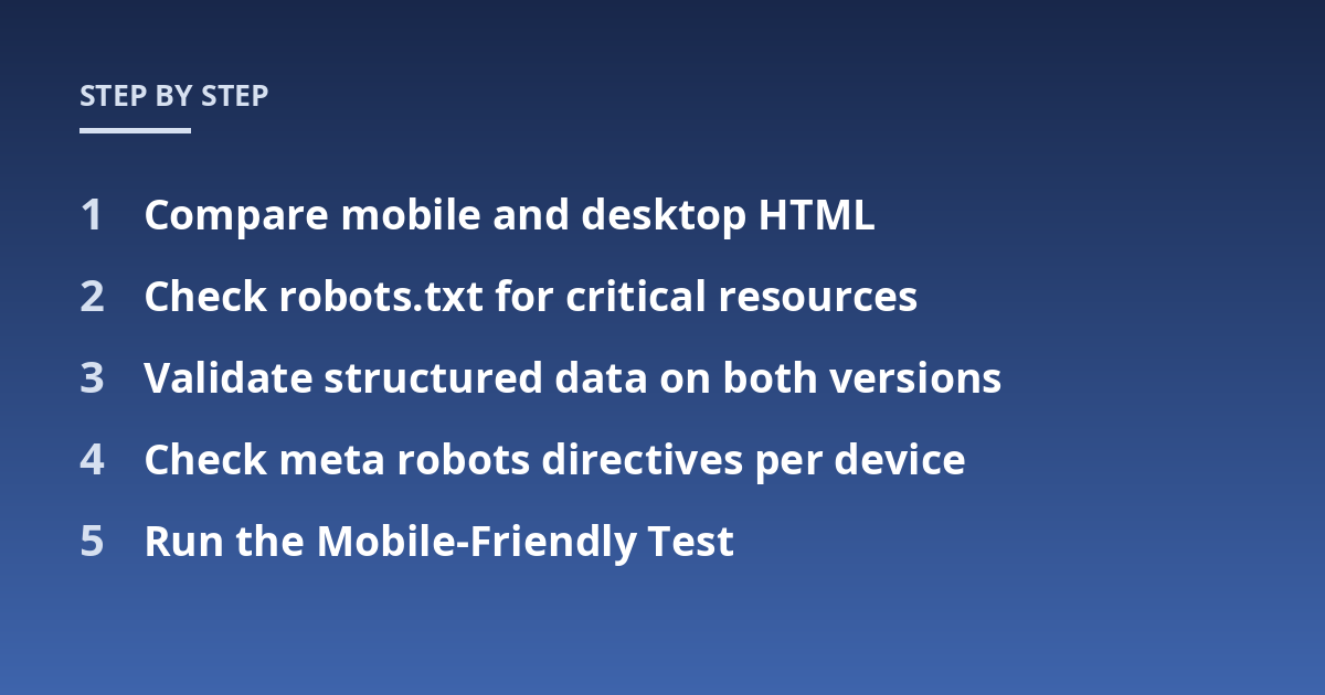
Beyond GSC, run these five checks manually:
- Compare mobile and desktop HTML: Load your page in a desktop browser and view the source. Then load the same URL using Chrome DevTools in mobile emulation mode and view the source. If the HTML content differs significantly (for example, the mobile version strips out paragraphs, images, or structured data), you have a content parity problem.
- Check
robots.txtfor critical resources: Look at yourrobots.txtfile and see if it blocks CSS, JavaScript, or image subdirectories. Googlebot needs those to render the page. A common mistake is blocking/assets/or/js/out of security caution. Use the robots.txt tester in GSC to confirm. - Validate structured data on both versions: Use the Rich Results Test on the mobile URL. Do not assume that schema on the desktop version is automatically recognized for the mobile version.
- Check meta robots directives per device: Some sites serve
noindexornofollowonly to mobile user agents. This can hide pages from the index completely. Verify by inspecting the mobile HTTP response headers. - Run the Mobile-Friendly Test: Google’s standalone tool at search.google.com/test/mobile-friendly tells you if the page is viewable and if resources are accessible.
What Happens When Mobile Content Differs from Desktop
Content parity is the single most common failure point. When Google indexes the mobile page but that page contains less information than the desktop version, the desktop advantage disappears. You lose ranking signals that the desktop version once provided.
Consider a product page. The desktop version shows a long description, specifications, reviews, and a FAQ section. The mobile version truncates the description after 200 characters and hides the FAQ behind an accordion. Google indexes the truncated description and does not see the FAQ content. The page becomes less informative in the index. Rankings for long-tail queries that relied on those specifications or FAQ terms drop.
This is not hypothetical. We have seen sites lose 30-40% of organic traffic for key pages after Google completed the mobile-first switch for that site, simply because the mobile version was a stripped-down shell. The fix is straightforward: serve the same content on both versions. If space is a concern, use CSS to hide content visually rather than removing it from the HTML. Google considers hidden-but-accessible content as indexable as long as it is in the source and not blocked.
Core Web Vitals and Mobile-First Indexing: What Actually Matters
Core Web Vitals are not a direct requirement for mobile-first indexing, but they affect how your mobile pages are evaluated in ranking. The mobile version is the one Google tests for Largest Contentful Paint, First Input Delay, and Cumulative Layout Shift. Poor mobile scores can offset otherwise strong content.
Three specific issues surface repeatedly on mobile:
- Layout shift from slow font loading: When web fonts load late, the text reflows after the initial render. This causes a high CLS score. The fix is to use
font-display: swapand preload critical fonts. - Large hero images: A 5 MB desktop image resized in CSS to fit a mobile screen still forces the mobile browser to download the full file. Serve scaled images using
srcsetattributes so the mobile browser picks a smaller version. - Third-party scripts blocking the main thread: Analytics, chat widgets, and ad tags often load synchronously on mobile. They delay interactivity. Move them to load asynchronously or after the main content.
The good news is that improving mobile Core Web Vitals usually improves desktop scores as well, because the underlying issues (heavy images, render-blocking scripts, slow server response) affect both versions. Focus on optimizing for a simulated 3G connection at 4X CPU slowdown. That is the testing environment Google uses for mobile assessments.
How Structured Data Works Under Mobile-First Indexing
Structured data placed on the desktop version does nothing for mobile-first indexing unless it is also present on the mobile version. In responsive designs, the same HTML is served to both, so the markup carries over. But if you use a dynamic serving setup or a separate mobile site, you must duplicate the structured data on the mobile pages.
Worth noting: Google’s guidelines explicitly state that structured data should be present on the version you want to be indexed. Since that is now the mobile version, the markup lives there. Do not rely on the desktop version to provide it.
For AMP pages, structured data must be placed in the AMP HTML itself, not in the canonical desktop page. Google treats the AMP version as the indexed page if it is the primary mobile version, so remove any assumptions about inheritance.
Common Schema Placement Mistakes on Mobile Sites
From what we have seen across different projects, these errors appear most often in audits:
- JSON-LD injected client-side via JavaScript that never runs during mobile rendering
- HTML microdata present only in the desktop template and excluded from the mobile template via conditional logic
- Product schema missing offer data because the mobile page hides the price behind a login or browser detection
Each of these creates a gap between what the page says it represents and what Google can see. The fix is to hard-code structured data in the server-rendered HTML for both versions, or use a single responsive code base where the markup is intrinsic.
What to Do If You Have a Separate Mobile Site (m. Subdomain)
If your site uses an m.example.com version separate from www.example.com, you have an extra layer of work. Google has publicly stated that separate mobile sites are not recommended, but they are still supported. The key requirement is that the mobile version contains all the same content as the desktop, and that both versions point to each other with the correct canonical and alternate tags.
Here is the checklist for separate mobile sites:
| Requirement | What to check |
|---|---|
| Canonical tag on mobile page | The mobile page must include a rel="canonical" pointing to the desktop page. |
| Alternate tag on desktop page | The desktop page must include rel="alternate" pointing to the mobile page. |
| Vary: User-Agent header | Both versions must send this header to avoid caching conflicts. |
| Content parity | All visible text, images, video, and structured data on desktop must also exist on mobile. |
No mobile-only noindex |
Ensure the mobile version is not accidentally blocked from indexing via robots meta tags. |
Most agencies we work with have migrated away from separate mobile sites by now. The maintenance overhead and risk of content drift are high. A responsive redesign is often cheaper than the recurring cost of keeping two codebases in sync.
Why Mobile-First Indexing Readiness Matters for AI Search Discovery
Google’s AI-powered search features, including AI Overviews and the newly announced AI Mode, draw from the same indexed content as traditional search. If your mobile version is thin, incomplete, or unrenderable, that is the version the AI will read. There is no separate crawl for generative AI features. The same index feeds both.
This makes mobile-first indexing readiness a prerequisite for visibility in AI search. An AI model cannot summarize or cite content it cannot access. It cannot pull product details from a desktop-only FAQ. It cannot reference a review schema that exists only on the desktop template. The mobile version is your only shot at being cited.
The practical takeaway: treat your mobile site as your canonical asset. If you had to choose between perfecting the desktop experience and perfecting the mobile one, choose mobile every time. That is where Google looks first.
FAQ: Mobile-First Indexing Readiness
What is the most important thing to know about mobile-first indexing readiness?
The most critical point is that Google uses the mobile version of your site to determine indexing and rankings. Content that exists only on the desktop version may not be indexed at all. The goal is to ensure full content parity, accessible resources, and correct structured data on the mobile version. A precise list of issues depends on a technical crawl and professional review.
When should mobile-first indexing readiness be discussed with a technical SEO professional?
A professional audit is useful when you see a sudden drop in organic traffic, notice that mobile pages rank lower than desktop equivalents, or are planning a site redesign. Early assessment can prevent the problem of thin mobile content from becoming a broader ranking loss. If you have a separate mobile subdomain, you should also check with someone who understands the redirect and canonical implications.
How should someone prepare for a mobile-first indexing audit?
It helps to note your site structure: responsive design, dynamic serving, or separate mobile URLs. Gather recent Google Search Console data, particularly the Mobile Usability report and the Index Coverage report. Existing sitemaps and robots.txt files can help the auditor understand what Googlebot can actually access. List any scripts or resources you suspect might be blocked for mobile user agents.
What risks or limits can mobile-first indexing have for a site?
Risks depend on the site architecture, the extent of content differences between versions, and the robustness of your server configuration. A mobile version that strips key content, blocks CSS and JavaScript, or serves incomplete structured data may lose visibility for important pages. The professional conducting the audit should explain the specific issues found, the recommended fixes, and the realistic timeline for seeing results after changes are implemented.
Does mobile-first indexing affect how Google treats images and videos?
Yes. Google indexes images and videos from the mobile version. If your mobile site serves images at a lower resolution or uses lazy-loading without providing enough context in the HTML, those images may not be indexed properly. Video structured data should be present on the mobile page as well. For best results, ensure mobile pages contain the same media assets as desktop, with appropriate alt text and schema markup.
Conclusion: Your Mobile Site Is Your Only Indexed Site
Mobile-first indexing is not a future change. It is the current reality for every site Google crawls. The mobile version is the version that gets indexed, ranked, and cited. Desktop content that does not appear on mobile is invisible to Google. The fix is not complex, but it requires a deliberate audit and a willingness to treat mobile as the primary experience.
Start with the five checks above. Run the Mobile-Friendly Test. Compare the mobile and desktop HTML of your highest-traffic pages. Fix any resource blocking in robots.txt. Once you confirm content parity and correct structured data placement, your site meets the basic threshold. From there, focus on improving mobile Core Web Vitals and loading speed to strengthen your position.
If you want a deeper technical assessment, consider a full SEO audit that covers mobile-specific issues, structured data validation, and crawl path analysis. TsoDen provides mobile-first indexing readiness evaluations as part of our technical SEO and content automation services. We can identify gaps that standard tools miss and implement fixes that restore visibility in both traditional search and AI-powered surfaces.
Other posts from the category
There are no posts for the selected category.

Latest posts from the category
-

What makes an effective Category Page for AI
June 5, 2026
-

What Influences the cost of AI Optimisation
June 1, 2026
-

Organisation Schema: how to help AI understand your brand
May 27, 2026